


Photography produced by Ann Taylor

Understanding Shifting Workplace Expectations
After half a century of designing business fashion, Ann Taylor was looking to modernize its brand to appeal to younger generations entering the professional workplace—which was itself evolving. There was a call for business fashion overall to shift emphasis from corporate hierarchy and power suits to a more casual, at-ease environment that allowed for better balance between work and social life. Being a legacy brand quite established in the category, Ann Taylor hired Combo to execute a brand update that could expand its consumer base to the millennial professional and reinforce its standing in contemporary business fashion.
Strategy Development
Combo developed the brand around the casualization of professional attire. This aligned with the new trends and changing attitudes toward the workplace that shaped younger millennial professionalism. Ann Taylor’s refreshed brand would need to reflect and respond to the realities of a multidimensional day. Messaging needed to embrace not only the transition from work to post-work social and personal life, but also all the different dimensions and modes one needs to navigate throughout the day.
Designing for Millennial Professionalism
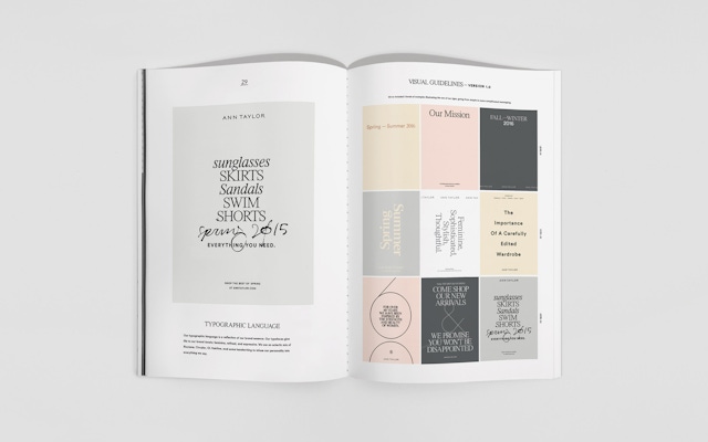
The Combo design team blended aesthetic inspirations from formality and professionalism with more modern gestures of ease and casualness. This came through elements in the design system, such as patterning that balanced the look of a formal monogram with the playful feel of a party print, and photographic treatments that paired portraiture with casual poses. The guiding principle was flexibility within an established brand world, with a contemporary design system able to accommodate it.
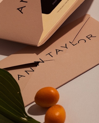
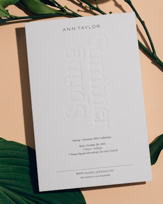
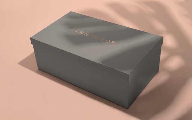
Establishing Millennial Pink
With a design system meant to encompass a range of moods, Combo designers took the brand color—pink—and pulled out varying shades. From blush pink to flirtier undertones of peach, from paler shades to ones that pop, a set of eight kinds of pink was curated to signal the multiple modes that today’s young professional moves though within the work day and beyond—buttoned up, business casual, athletic, social. Similarly, five different typefaces were chosen. While such a range is atypical for brand typography, this choice was strategically aligned to bring together the playful and serious notes in a contemporary way.
Softer than bubble-gum and bolder than pastel, the hue has been mentioned over 32,000 times online in 2017.
New business: Connect with a partner.
Job inquires: View our handbook.
Newsletter©: Sign up.
Combo
76 Bowery, 3rd Floor
NYC, 10013
Social Media
Instagram, LinkedIn
View our show reel:
Watch video
General inquiries:
hello@combo.co
Media inquires:
press@combo.co